Work / Project details


Allied Irish Bank
Company
Product Designer
My Role
Mobile
Platform
2 months
Timeline
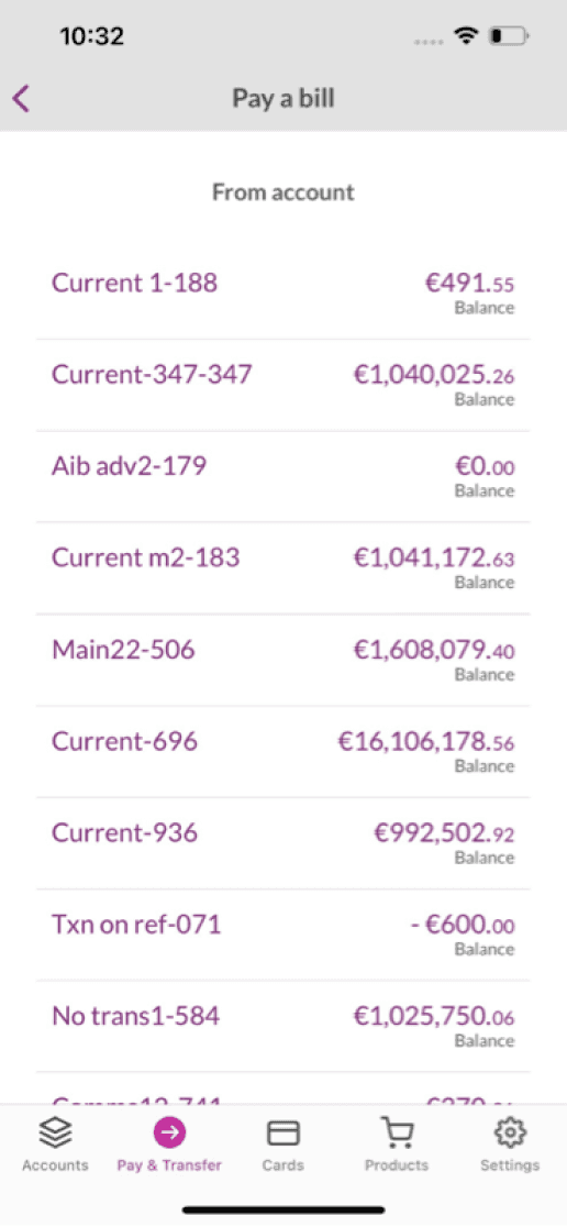
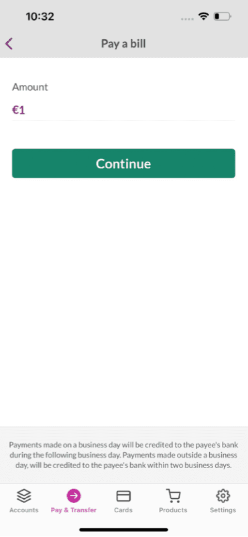
AIB is the largest bank in Ireland catering for over 3.2 million customers across Ireland and the UK. Their ‘Pay a Bill’ feature on the mobile app is outdated, and as a result of this the customer interaction with the feature is extremely low. I was tasked with improving the overall user experience of this feature with the end goal of increasing the customer interaction and usage with ‘Pay a Bill’ feature.
Customer engagement with the Pay a Bill feature was extremely low due to lack of basic features like adding a new payee/biller their account which could only be done via the web app, and like setting up recurring payments




Identifying the research goals
To kickstart the research phase, I first identified what my goals were and what exactly I wanted to get out of my research phase. These goals were broken into 3 main points. This helped to guide my research and in the right direction from the offset.
Establish common pain points in the existing flow.
Gain a better understanding of users need for Pay a Bill, in order to correctly add value.
Find key insights from customers when it comes to paying/setting up bill payments.
Analysing the current journey
From the data we know that among all payment types offered within the app, the 'Pay a Bill' feature has a significantly lower engagement rate, with a percentage of only 3% of current users actively using this feature over the course of a six month period (October 2022-March 2023).


Exploring competitor approaches
It was clear form researching both local competitors and international banks that our product was lacking many of the basic features that our customers would expect in relation to bill payments.
Defining the problems
After analysing our current journey, analysing our competitors approach and gaining insights into our customers mindset and perspectives around paying a bill, we could now define the most problematic areas with the current user experience.
Users avoid using this feature as they must go onto the website in order to add a new biller/payee.
The interface is dated and not in line with the rest of the flows within the app.
Designing a solution
Once the problem areas were defined we began developing various concept and possible user flows. As we narrowed down our concepts and decided on a suitable approach for both the customer and the business, we progressed our designs into a higher fidelity.
As these designs progressed, we continuously communicate with our UI Design principle, as well as holding design critiques with the wider design team. This was found to be a great method of getting great feedback, while also aligning with other designers who were facing similar UI challenges before bringing the design into user testing.
Task flow exploration
The existing Payments screen was largely fixed, forcing bespoke implementations whenever a bank requested a different layout or prioritisation.

Progressing concepts into higher fidelity
As we narrowed down our concepts and decided on a suitable approach for both the customer and the business, we progressed our designs into a higher fidelity.
Validating the design through testing
To validate our proposed solution, we ran usability testing with our customers. We tested the full flow


Users can now add new billers and pay them within the app, as opposed to going online to the AIB website in order to add payable billers to their account.


User can choose the date they wish to make the payment. This includes setting up a bill payment to paid at a future date. Users can now set up their bill once and have it paid automatically every month on their chosen date.

