Work / Project details

Designing a configurable payments hub for banking clients.

Designing a configurable payments hub for banking clients.

Designing a configurable payments hub for banking clients.

Sopra Banking Software

Company

Product Designer

My Role

Mobile and Web

Platform

2 months

Timeline

Banks using SBS had different priorities for their Payments experience. Some wanted recent payees to be the primary focus, while others prioritised quick actions such as sending money or paying bills.


I designed a configurable Payments hub that allowed each bank to tailor the experience to its customers while maintaining a consistent product, scalable design system, and modern user experience across the platform.

Banks using SBS had different priorities for their Payments experience. Some wanted recent payees to be the primary focus, while others prioritised quick actions such as sending money or paying bills.


I designed a configurable Payments hub that allowed each bank to tailor the experience to its customers while maintaining a consistent product, scalable design system, and modern user experience across the platform.

Banks using SBS had different priorities for their Payments experience. Some wanted recent payees to be the primary focus, while others prioritised quick actions such as sending money or paying bills.


I designed a configurable Payments hub that allowed each bank to tailor the experience to its customers while maintaining a consistent product, scalable design system, and modern user experience across the platform.

The challenge

The challenge

The challenge

Rather than customising the Payments screen separately for each client, the goal was to create a single framework that could adapt to different banking priorities without compromising usability or consistency.


Three key challenges shaped the project:

Rather than customising the Payments screen separately for each client, the goal was to create a single framework that could adapt to different banking priorities without compromising usability or consistency.


Three key challenges shaped the project:

Configurability without fragmentation

Configurability without fragmentation

The existing Payments screen was largely fixed, providing banks with little configurablity to create a quality experience for their customers market.
An outdated experience

An outdated experience

The interface no longer reflected modern mobile banking expectations. Information hierarchy, spacing and component styling reduced clarity and weakened the overall experience.
Unnecessary friction

Unnecessary friction

Common payment journeys contained avoidable decision points and extra steps, making everyday transfers feel longer than necessary.

Designing a configurable system

Designing a configurable system

Designing a configurable system

The most difficult part of the project wasn't redesigning the interface, it was defining the rules that made configurability sustainable.


I began by analysing the existing experience to identify friction points, benchmarking leading banking apps, and working with stakeholders to establish which areas of the experience should remain fixed and which could safely be configured.


From there, I explored multiple layout directions and transfer journeys before defining a flexible widget system that could support different bank priorities without sacrificing consistency.


Instead of creating entirely different experiences for different clients, the solution established clear layout rules, reusable components widgets and predictable behaviours that could scale across implementations.

The most difficult part of the project wasn’t redesigning the interface, it was defining the rules that made configurability sustainable.


I began by analysing the existing experience to identify friction points, benchmarking leading banking apps, and working with stakeholders to establish which areas of the experience should remain fixed and which could safely be configured.


From there, I explored multiple layout directions and transfer journeys before defining a flexible widget system that could support different bank priorities without sacrificing consistency.


Instead of creating entirely different experiences for different clients, the solution established clear layout rules, reusable components widgets and predictable behaviours that could scale across implementations.

The solution

The solution

The solution

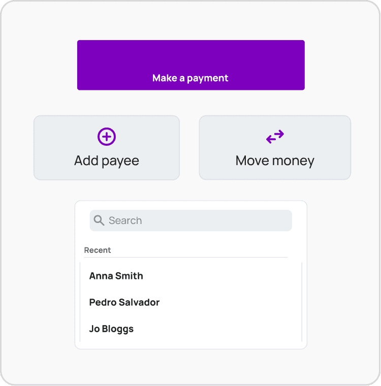
A configurable Payments hub

The redesigned Payments hub is built around configurable widgets, allowing banks to prioritise the features most relevant to their customers while preserving a consistent interaction model.

A modern visual hierarchy

The interface was redesigned using updated spacing, typography and component styling to improve scanability, strengthen hierarchy and bring the experience in line with modern mobile banking products.

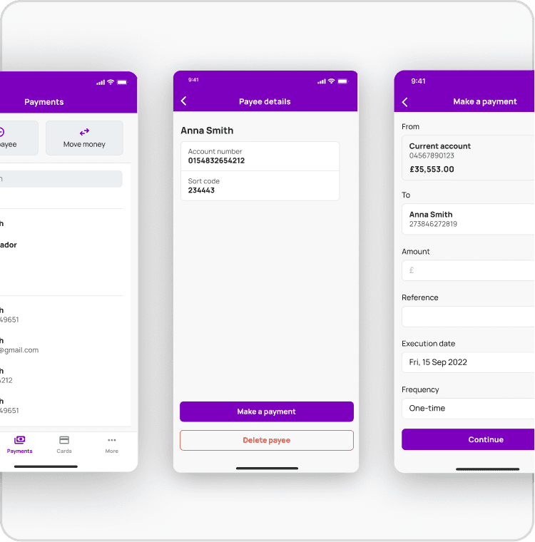
A simplified transfer journey

The transfer flow was streamlined by reducing unnecessary decision points and presenting information progressively. Rather than simply removing screens, the redesign focused on reducing cognitive load throughout the journey.

Validation

Validation

Validation

The redesigned experience was evaluated through moderated usability sessions with five participants using an interactive prototype.The sessions focused on three key questions:


  • Could users quickly identify primary payment actions?

  • Could users easily locate recent payees and payment activity?

  • Did the redesigned transfer flow reduce hesitation during completion?

Improved discoverability

All participants located their intended primary payment action without assistance, with noticeably less scanning compared to the existing experience.

Reduced hesitation

Participants moved through the transfer journey with fewer pauses, particularly during account selection and payment review, where clearer hierarchy reduced uncertainty.

Greater confidence

Users consistently described the redesigned interface as cleaner and easier to understand, with several commenting that important actions felt "more obvious" and "better organised."

Project reflections

Project reflections

This project reinforced three lessons.


  1. Configurability only works when supported by clear design rules. Without them, flexibility quickly becomes inconsistency.


  2. In financial products, visual hierarchy has a direct impact on confidence and task completion. Small changes to spacing, grouping and emphasis can significantly improve usability.


  3. The most effective way to make a journey feel faster isn't always to remove steps, it's to remove unnecessary decisions.

This project reinforced three lessons.


  1. Configurability only works when supported by clear design rules. Without them, flexibility quickly becomes inconsistency.


  2. In financial products, visual hierarchy has a direct impact on confidence and task completion. Small changes to spacing, grouping and emphasis can significantly improve usability.


  3. The most effective way to make a journey feel faster isn’t always to remove steps, it’s to remove unnecessary decisions.

This project reinforced three lessons.


  1. Configurability only works when supported by clear design rules. Without them, flexibility quickly becomes inconsistency.


  2. In financial products, visual hierarchy has a direct impact on confidence and task completion. Small changes to spacing, grouping and emphasis can significantly improve usability.


  3. The most effective way to make a journey feel faster isn’t always to remove steps, it’s to remove unnecessary decisions.

Copyright · 2026